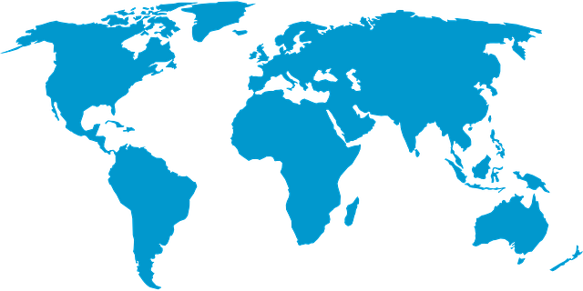
Mercator’s map distorts the actual size of landmasses, overinflating those near the North and South poles, reports National Geographic. On Mercator’s map, Greenland and South America appear nearly the same size, but South America is actually eight times larger. Similarly, North America appears much larger than Africa when the opposite is true. Africa is bigger than the U.S., Canada, and China put together.
Misrepresentations like these have broader, concerning implications. The way places are presented on a map affects our perception of those places themselves, reports the Borgen Project. This phenomenon is known as “map bias.”
Source: Biases in world maps: What does the world look like? – Deseret News
Similarly, many of us grew up with the famous Mercator projection map with the U.S. in the exact center. This, of course, biases our view of the U.S. and its role in the world. Simultaneously, this projection made the former U.S.S.R look positively enormous – and scary. Thus, the maps became a tool of propagandists.
Image by Clker-Free-Vector-Images from Pixabay