
Charts are created automatically from data that I typically update around early afternoon of each day from official Oregon Health Authority daily updates.
Charts come from 3 cloud-based spreadsheets and may take some time to load.
I am not an authority - these charts should be treated as "FOR ENTERTAINMENT PURPOSES ONLY". Please assume I am an idiot and that I have cherry picked all data and everything you see here is either wrong or stupid..
These charts are created from OHA supplied "Daily Updates" data, and sometimes from OHA supplied "Data Dashboard".
See many more notes at end of this file.
MAJOR CAUTION
THE CASE COUNTS ARE THE COUNTS AS RELEASED IN THE OHA DAILY UPDATES.
I HAVE DOWNLOADED THEIR "DATA DASHBOARD" WORKSHEET AND THE DATA VALUES THEY SHOW, EACH DAY, ARE ***SIGNIFICANTLY*** DIFFERENT THAN WHAT WAS REPORTED IN THEIR DAILY UPDATES. I HAVE NO WAY TO DETERMINE WHY THESE VALUES DIFFER SIGNIFICANTLY. DATES PRIOR TO MARCH 29 SHOW "DATA DASHBOARD" VALUES AND DATES FROM MARCH 29TH ONWARD SHOW THE DAILY UPDATE VALUES.
I will ask OHA about the data discrepancies but do not expect to receive a reply. Neither OHA nor the Governor's office respond to citizen inquiries.
TEST RATIO DATA
As of May 27th, during the prior week, state-wide positive tests were 1.7% of all those tested. The percent testing positive remained below 2% until (roughly) the Lincoln county fish processing plant outbreak and then the Island City church fiascos - when the weekly positive tests then crossed above 3% again.
The following reflects total test ratio and percentage since the very first test in March (which includes nearly two months of testing almost no one due to lack of tests such that positive test results were a greater percentage - you had to be almost dead to get tested then - unless you were the elite, like the Governor and her husband, who both were tested in March because they had head colds.)
The test ratio measures the total number tested for each confirmed case (e.g. 29:1). The goal is for this to be a high number such that 1/test ratio (e.g. 29) is a small percentage.
Total tests done for each confirmed case:
Percentage testing positive since first tests in March:
For the most recent weeks, the percent positive has been about 1.7%.
CHARTS
The "daily body count" reflects the day that OHA counted the death in their public information release. In reality, this is not the "day of death". Per May 10, 2020, the death count went up by 3 but all 3 deaths were from 3 to 10 days earlier. Therefore, use caution in interpreting a particular day's death count.
Daily body count
Cumulative Deaths Statewide, Log Scale
Cumulative Deaths, Linear Curve
This data was recorded by hand from OHA "Daily Updates", starting in late March. The OHA Data Dashboard does not provide a downloadable set of "death" data for comparison. Note that the "curve" is linear, and not the much discussed "exponential" curve.
Five Day Moving Average % Change in Daily Deaths
Case Fatality Rate for Oregon
New Cases Trends
CAUTION
Daily new cases in Oregon (Line Chart)
NOTE - Protests and riots broke out in Portland and Eugene beginning May 28th and onwards. Protests were still occuring as of June 10, 2020. These activities did not include "social distancing" and it is possible that 1-2 weeks after the onset of these protests the state will see an increase in new Covid-19 cases. Or may be not. If "not" then it means the draconian closures of parks, state forests and US Forest Service lands was not necessary.
7-day moving average of new cases in Oregon
On the day I set up this chart, the average number of new cases per day was 56. Hence, the chart shows "above average" in red. This is based on the post March 29th "daily update" figures.
Daily new cases in Oregon (Daily Update) (Bar Chart)
Cumulative cases in Oregon (Daily Update), Linear curve
This chart is based on my logging the OHA "daily updates". However, the daily updates have significantly different daily values than OHA "Data Dashboard" data downloads. No explanation for that. Because OHA did release much information prior to the end of March, I did not record "daily update" values prior to March 29th. Note that the "curve" is linear and not the much discussed "exponential" curve.
Cumulative cases based on OHA Data Dashboard data, linear curve
Major discrepancies Between Daily Update and Data Dashboard
OHA releases a total of new cases for the prior day in a "Daily Update" release.
Separately, OHA has a "Data Dashboard" to display an OHA chart of daily new cases. From that page, the data may be downloaded.
When I compared the "Daily Update" values to the "Data Dashboard" I find significant discrepancies that are left unexplained by OHA. These discrepancies are in addition to the different "peak" days shown on various pages and "Data Dashboard" data values. This chart shows the "new cases" as reported by the Daily Update and separately by the Data Dashboard. Clearly, they are not the same.
Of interest:
Of interest, the "curve" was already flat between March 15th and March 23rd, when the lockdown order went into effect. Peak hospitalization day, per OHA, was March 23rd. This suggests that the "lockdowns" may not have had much impact on the shape of the curve. Social distancing, work place changes and hand washing may have been the important factors.
The curve was already linear for about 2 weeks before the lockdown went into effect. But note that "Flatten the curve" referred to the hospitalization curve, not new cases. The hospitalization curve was trending down in late March per the OHA's hospitalization chart.
Would love to have an "expert" provide input on this.
The "exponential" curve we heard much about appears to be true only at the very start of the epidemic. By mid-March, the curve was "flat". It may have flattened due to voluntary measures.
Note: In first half of June there were two large outbreaks. One at a fish processing plant in Newport, OR, and then several hundred at a Church in Island City, OR, next to La Grande. The latter was caused by the Church holding large events, tightly packed, with singing and dancing, including church services, a very large wedding, and a very large graduation ceremony. This resulted in the increasing slope of the curve in mid June. After some church goers tested positive, Covid-19 antigen tests were offered to everyone in attendance. There has been no report as to how many were symptomatic versus asymptomatic.
OHA Chart of Hospitalizations
Note their chart shows peak day as March 28th with 28 admissions. This chart is DIFFERENT than their Data Dashboard data which shows peak day of April 1 with 28 admissions. Again, the discrepancies throughout their data are never explained.
Flattening the Curve - and Hospital Use Increasing Metric
The media is tracking the increase in hospitalizations at 3 months after the original lockdowns as most states have done some degree of "re-opening". There are concerns that hospitalizations are increasing again (as of mid June). However increasing the sick, now, was the theory behind the original "flatten the curve". The goal was to lower the initial number of hospitalizations, to avoid overwhelming hospitals - BUT - and this is important - the intent was to shift those hospitalizations into the future, not eliminate them. We "flattened" the red curve and shifted those hospitalizations to the "blue curve". We are now on the increasing side of the blue curve. That is, if that hypothesis from February 27th, is correct.

OHA Chart of Peak Day of Covid-like Symptom Presentation to ERs
Peak Day is March 13th, with a slightly lower second peak on March 21.

Daily Increase as a Percent Change
Unofficial "Hospital Intensity" Metric
This chart graphs a ratio of the 5-day sum of hospitalizations to the 5-day sum of new cases. Initially, we had a lot of hospitalizations but daily new cases were not that high. As time went on, the number of daily new cases being diagnosed went up, but the number of hospitalized patients went down. This suggest that we are now diagnosing cases that are much milder, than before (likely due to increased testing), or that the disease is becoming weaker (questionable) or that out of hospital treatments have improved (unknown). UPDATE: Statement from OHA June 17 2020 -"The percentage of emergency department (ED) visits for COVID-19-like illness remain below 1%, suggesting that many of the cases now being reported are lower in severity or otherwise not coming through EDs"
Hospitalization and Hospital Resources In Use
Note: The number hospitalized for Covid 19 confirmed AND presumptive is always about twice as many as confirmed cases. We assume that a presumptive patient in the hospital is going to be tested, right? But since the confirmed case counts are always half the confirmed+presumptive total, this implies that most of the presumptive cases were not actually Covid-19? Or that the test do not work? Something makes no sense here.
For this reason, I believe the only valid metrics are the ICU confirmed cases and ventilators in use number.
As of Jun 6, OHA no longer releases hospital utilization data on Saturday and Sunday. Consequently, for every week after June 6, the last released figures of Thursday are filled in for Fri, Sat and Sun, and then resume updating on Monday when OHA again releases data - but only for Monday - FridayCAUTION: Because we have seen weekly peaks in numbers late in the week, this may artificially extend a high value (or low value) across Friday-Sunday, resulting in the visual trend being incorrect. For example, Thursday shows a high value - this is filled in for the missing Fri-Sat-Sun values. But unknown to us, the value dropped on Fri and remains low. But we have no way of knowing as OHA no longer releases any data for the weekends so the chart can be very misleading when days of data are missing each week. Corollary: Covid-19's threat to Oregon is now so diminished that weekend updates are not longer important.
Cumulative Hospitalized Cases Count from OHA Data Dashboard Data
Note that this is a linear chart and the curve is not exponential.
Hospital Confirmed Cases
Hospital Confirmed and Unconfirmed Cases
ICU Confirmed Cases
Ventilators in Use
Cases by County Trends
Top Counties Only
New Cases in Counties Having Large Numbers of Cases
At time of this writing, that is the Top Six counties
Percent of Daily New Cases in the Top Counties
Number of new cases in the top counties
Deschutes County
Daily new cases in Deschutes County
Deschutes County Cumulative Cases
Deschutes County Estimated Active Cases
In this chart, a case is defined as "Active" for 20 days after it was first reported. According to the OHA, the median time to recovery is 20 days. This is a sum of the total outstanding cases for the prior 20 days. This is unofficial and appears to underestimate the number of recoveries per OHA published estimates on recoveries.
Economic Data Section
Apple Mobility Data
Financial Data
These charts show the trillions of dollars printed by the Federal Reserve. Longer term, this leads to inflation - first in asset prices (hence stock market going up) and then later in consumer price inflation, although there are multiple factors at work.
TSA Passenger Data
Passenger Count as percent of prior year
Passenger count as percent of same day the prior week
OTHER DATA - ER Utilization, ER-Visits for Covid, Flu-like Symptoms
ER Utilitization and Percent of ER visits due to Covid-like symptoms
These charts of Oregon ER utilization and percent of ER visits that have Covid-like signs and symptoms are produced by the Oregon Health Authority. "Covid-like" symptoms are based on clinical observation and not a test. "Covid-like" is a subset of the CDC's "Influenza-like Illness" category.
ER visits began to fall in March due to publicity that ERs were overwhelmed, and fell further when the Governor, shortly thereafter, banned all non-emergency procedures, resulting in people not seeking care for bona fide reasons. This included a 50% drop in presentation of patients with heart attack symptoms and a 30% drop in presentation of patients with stroke symptoms. I also had a broken foot during this period and was unable to see a doctor. Since Oregon did not experience a spike due to Covid-19, Oregon hospitals have been running with -30 to -50% fewer patients. The loss of revenue has resulted in thousands of health care workers having hours cut, being furloughed or being laid off. Several rural hospitals report they could become bankrupt and close.
The goal is that the % of Covid-like presentations to Oregon ERs is below 1.5%. This is the threshold value for off season ILI per the OHA. The blue line in the 2nd chart is a measure of Covid-like ER presentations, as a percent. As of June 11, per OHA, the statewide Covid-like presentation to ERs is now 0.6%.

OHA ONLY UPDATING THESE CHARTS ONCE PER WEEK - FACE PLANT - GO HERE for OHA official charts (new features from OHA).
This chart includes:
Official Criteria for Re-Opening Includes that Influenza-like symptoms are at a low level
Oregon's Official criteria for re-opening counties includes that the CDC report of Influenza-Like Illness (ILI) is at a very low level for each county (preferably below 1.5% of ER visits). Covid-19 is a subset of "ILI".
Here is a link to CDC ILINet State Activity Report
Here is a link to the Oregon government ILI pages.
Here is the chart I captured - Oregon discontinued updating this chart in mid-April because the flu season is over, or something. Considering we are in the midst of a pandemic it seems that this data and chart ought to continue being updated but they are not.

The State of Oregon says that they are taking into consideration a comparison of today's illness outbreak to the Influenza-Like Illness tracking and that a low value is part of the criteria for re-opening the economy. For Oregon this will be compared on a per County basis but "per County" data is not made publicly available so I can only show the state level data.
"Covid-like" is a subset of ILI and is determined solely by clinical observations of symptoms. Neither it nor influenza diagnosis is based on test per the CDC.
CDC produced chart of ILI for the nation


CDC produced chart of ILI for OREGON

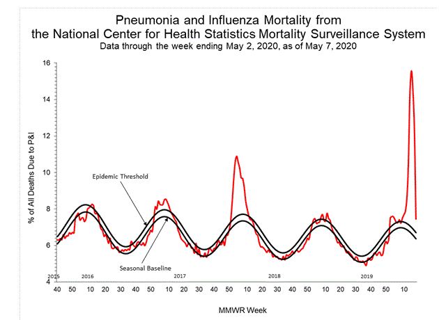
The next charts show the CDC influenza + pneuomonia mortality chart for the entire state of Oregon. This chart is updated on this page, infrequently. THIS IS NOT THE CHART OF ILI.

For comparison, here is New York City

For comparison, here is Michigan

This page and all content on this page is FOR ENTERTAINMENT PURPOSES ONLY.
-------------------------------------------------------------------------------------
IF YOU JUST WANT THE CHARTS WITHOUT EXPLANATIONS, DATA CHANGE HISTORY, ETC, THEN JUST PAGE DOWN AND WAIT FOR THE CHARTS TO LOAD.
OHA CHARTS
OHA hides data from public. (One of several reports on this topic by The Oregonian.)
Use caution when interpreting any trend lines. I created this page solely for my own quick reference from any computer. Assume all data is incorrect or cherry-picked to present a biased picture. Any interpretation you make is at your sole discretion and responsbility.
Charts here may look slightly different than charts provided by others. This usually occurs because OHA sometimes changes past data. Some times I catch the changes, sometimes I do not. The same occurs for official charts you may see online elsewhere - they often miss the "past data" changes. On June 15th, I discovered that the Daily News Update value seem to be slightly different than the "News release" page values. I have gone back and changed some of the recent daily totals to those in the "News release".
Link to Oregonian's "by zipcode" case tracker after OHA released zip code data on May 5th: Link to Oregon Zip Code Tracker
OHA REPORTING CHANGES
Example: Recently, some workers in a fish processing plant tested positive so all workers were tested. 124 of them tested positive - but incredibly, 95% were asymptomatic per the OHA. That is a lot of confirmed cases that would never have been counted just weeks earlier. This, in turn, coincided with the first weekend of "missing data" from OHA such that on Monday, the updated total had skyrocketed by about 350 cases (three days with an unusual event). This, in turn, led to news media nationwide reporting that Oregon was experiencing a "surge" of "Second wave" cases, even though by Monday and Tuesday, the count was back in the normal daily range.
Beginning on May 4th, OHA began including "presumptive" + "test confirmed". A presumptive case may include those with a negative test result - OHA --> "Includes cases confirmed by diagnostic testing and presumptive cases. Presumptive cases are those without a positive diagnostic test who present COVID-19-like symptoms and had close contact with a confirmed case."
PEAK DAYS TIMELINE
[*] Note on May 20th. According to KATU, and then the Oregonian, a large family social gathering took place in Deschutes County prior to the May 15th "Phase 1" re-opening plan with an ill family member. As part of newly expanded contact tracing, after this case was confirmed other attendees were then tested and found to be positive. All of the contacts took place BEFORE THE MAY 15th "RE-OPENING" - Deschutes County Public Health said very specifically this occurred before May 15th AND was not due to community spread. About 75% of all new cases - what the media called a "spike" - that week were due to this get together. Much of the news media reported this as "Breaking news: Central Oregon sees surge of cases DUE TO RE-OPENING" which was not true but made for a scary headline. A related issue is the use of perjorative wording by the media: an "increase" is a "surge" or "spike" - because the media knows that fear sells. But this increases anxiety and health problems associated with anxiety
Comments from OHA on the Effect of More Testing
From the Oregon Health Authority:
Readers might notice that, although Oregon is moving towards reopening some businesses and relaxing some of the restrictions on daily activity, more COVID-19 cases and deaths were reported during the week of May 4 through May 11 than during the preceding week (394 cases and 14 deaths). However, the actual number of new infections (also called disease "incidence") probably did not increase; rather the increase in reported cases is most likely due to increased testing and increasing numbers of presumptive infections. The number of COVID-19 tests reported in Oregon rose from 12,684 in the week ending May 1 to 14,481 in the week ending May 8, a 14% increase, while the proportion of tests that were positive fell to 3.1%, its lowest level since OHA began tracking COVID-19 testing
Relative Risk Observations
To help keep personal panic under control, it may be helpful to put the risks in perspective by comparing that risk to other common risks.
As of the end of May 2020:
An OSU random sample survey of over 600 people in Corvallis, and over 600 people in Bend, found zero cases of Covid-19. (Each person was tested for Covid-19). Since they could not find anyone in their sample who had Covid-19, they instead used a model and estimated that 1 in 1,000 people have Covid-19 at any time. But they honestly do not know - a model is not data. If you meet a random selection of people in Bend, the probability that you contact someone with Covid-19 is p=0.001. It is said that if you maintain six foot social distancing, your odds of contracting Covid-19 fall by an additional one to two orders of magnitude (this appears to be another model output, not based on data). Thus, we then have p=0.0001 or may be p=0.00001. Furthermore, the CDC and WHO say you need to have extended close contact (various estimates are 5 to 15 minutes) which cuts the p value even more. It seems that the liklihood you pick up Covid-19 from a random, momentary near contact in a grocery store is close to zero. One does not need to be an expert to see this. NOTE - this only applies in my community. The prevelance may be very different in your community. It would be extremely helpful if public health would provide honest assessments so that the public could gauge relative risk, rather than causing severe anxiety, angry mask shaming, and other societal dysfunction. The State of Utah has published data on where contacts occur - per Utah, of the fully traced contacts (about 85% of all cases) about 60% are extended close family contacts, about 25% are extended close social contacts, about 5% are at work, and the remaining 10% are "travel related" or "other/unknown". This is useful data that can help to control anxiety. BUT you should not extrapolate Utah's data to your community - different lockdown rules, different family dynamics, etc. This is why local public health should release similar information.